Learning about Forms: Form Components
Learning about Forms: Form Components
Form Component Types
Date | E-mail | Fieldset | File | Grid | Hidden | Markup | Number | Page Break | Select Options | Textarea | Textfield | Time
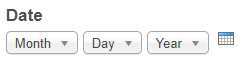
Date
Provides month, day and year drop-down fields, as well as a pop-up calendar, for date input.
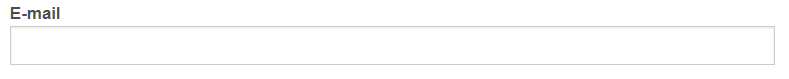
Provides a field for e-mail address input, and validates the submitted value is an e-mail address. Use this form component type, then you can select it as the form component value to specify the recipient and/or sender. Learn more about setting up email recipients for a webform.
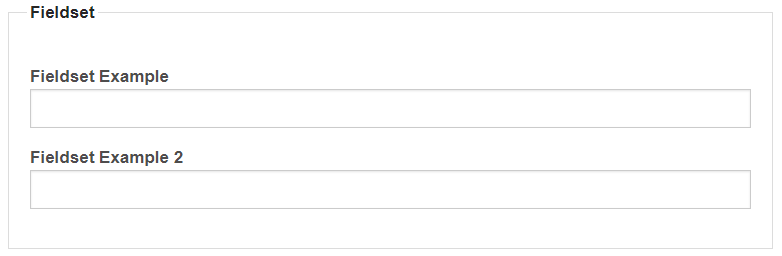
Fieldset
Used for grouping form components; use the drag-and-drop handle to arrange components that are part of the group as child items of the fieldset. This example of a fieldset component includes two textfield components as Fieldset Example and Fieldset Example 2.
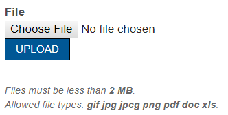
File
Provides a file upload for attaching files to form submissions.
Grid
Provides a grid formatted field for radio button (single selection) or check box (multiple selection) input. Questions are formatted as rows, and responses are formatted as columns. All questions in the grid component have the same options for a response. Create separate grid components for differents sets of responses.

Hidden
Provides a hidden field for internal content entry. Label and text in hidden field will not be displayed on the webform, but will be included in the data saved. A Hidden field does not provide for any input by the webform submitter.
Markup
Provides a field for content entry by the form creator. Content in the markup field will be displayed on the webform. Markup fields are typically used for text, links, or images to be displayed within the webform components - i.e. for additional instructions. A Markup field does not allow for the webform submitter to provide a response.
Number
Provides a field for number input.

Page Break
Provides a field for number input.
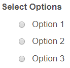
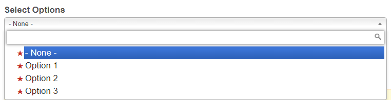
Select Options
Provides a select field for text input. Radio buttons are provided for single-value selection. Checkboxes and list boxes are provided for multiple value selection.
Radio buttons:
List box:
KNOWN BUG for Select Options: Double Label display (the question appears twice)
- From the Form Components tab of your webform, Edit the form component label so that the Label Display is now set to None rather than it's default setting: Above. This will remove the label entirely (removing the duplication, too).
- Then, create the form component type, Markup, with the same title as the original form component ("How did you hear about us?"), but the form key must differ to avoid duplication of form keys.
- After adding a label name and unique form key to this Markup form component, this is the step where you change the text editor from WYSIWYG to Full HTML.
- In order to get it to still look like a label, and, more importantly, read as a label by the browser, you would use the following (w/ the bold text being required and the regular text being your customizable text):
-
<label>Component Label<span class="form-required">*</span></label>
-
The HTML text above is for a required field. If your Markup/Select Options is not a required question, remove this portion before pasting into your text editor:
<span class="form-required">*</span>
-
-
You can also add a description below, for example:<label>Component Label <span class="form-required">*</span></label><p class="description">Description</p>
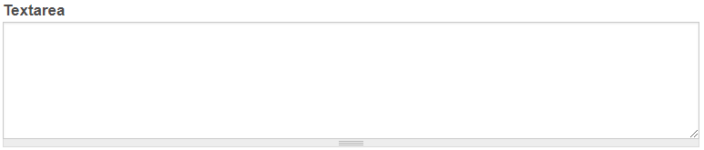
Textarea
Provides a large, expandable field for any text input.
Textfield
Provides a field for any text input.

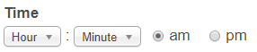
Time
Provides a field for a specific time to be collected.
MyLO FAQ Category:
- Best practices, Content editing, General