By Lynn S. Teague, League of Women Voters
The process of redrawing South Carolina’s legislative maps kicked into gear with the Aug. 12 release of U. S. Census data. Since then, there have been public hearings, committee meetings, public map submissions and much more.
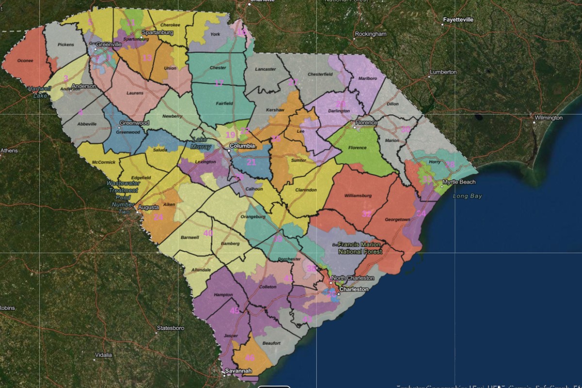
 Now three months later, the Senate has released its staff proposal for Senate districts and the House has released its draft plan for House districts. Both have a long way to go (through Judiciary committees and floor votes and the governor’s signature) before they are final.
Any redistricting map must respond to the changing population of our state. There is very rapid growth in the suburbs south of Charlotte and even greater growth along the coast, especially in Horry County, but also in and around Charleston. Other areas increased in population but not so quickly. Finally, the Interstate 95 corridor has lost population. This has many implications, but for purposes of redistricting, it means that political power shifts with population.
How this is handled is important to all of us. There are strategies for map drawing that are focused on the interests of the residents of our state, and others that are focused on the interests of legislators. The League’s own maps and its assessment of other plans are based on the belief that the interests of constituents, not legislators, should prevail.
Senate map reveals little gerrymandering bias
From that perspective, the initial Senate proposal has much to recommend it. The Senate map provides as many competitive districts as does the League map. Very few precincts are split, a practice that is sometimes needed but is too often related to cherry-picking voters to engineer a district for a candidate or party. The Senate plan also reduces expected average election margins below those in current districts, suggesting that district homogeneity has not been inflated to produce forbiddingly large “safe” margins for incumbents. Finally, sophisticated mathematical tests for gerrymandering do not reveal evidence of significant bias.
There are other variables to consider. Keeping communities of interest and political subdivisions together are important. In the Senate plan, some cities have been made whole. Spartanburg, for example, would cease to be divided among three senators. Mount Pleasant is not so fortunate.
Our greatest concern about the Senate map relates to its handling of the changing landscape of the Lowcountry. With its current population, District 39 may continue to provide minorities an opportunity to elect a candidate of their choice, but it is drawn with a relatively low 39 percent Black Voting Age Population (BVAP). That could change quickly. The district includes areas in Berkeley County, including Nexton, Carnes Crossroads and Cane Bay, where population growth is both rapid and very different in character from the rural core of the rest of the district.
Broader concerns about House map
League concerns about the map proposed by the House Redistricting Committee are broader. We recognize that the population in our state is not evenly distributed so that many districts will not be competitive in general elections. However, based on our data, the draft House map produces only 12 districts in which the partisan lean margin is plus-or-minus 5 percent, which is considered competitive. This is four districts fewer than in the current map and seven districts fewer than in the League proposal. Noncompetitive districts deprive citizens of a meaningful vote. Legislators have picked their voters, leaving nothing meaningful for the voters to do at the polls in November. With more than 41,000 persons in each House district, seven non-competitive districts add up to more than a quarter-million extra South Carolina residents whose representation is decided by legislators, not voters.
This map also fails to respect genuine and important communities of interest. James Island, for example, is thoroughly fragmented. The districts that converge there are oddly configured, for example with District 110 linking one James Island fragment with part of Mount Pleasant. The map submitted by the League shows that it is possible to map this area with more compact districts and with greater adherence to political subdivisions and communities of interest.
Finally, analysis using widely accepted redistricting mathematical evaluation methods shows that the House map displays extreme bias. Of about one billion maps that were simulated, only 1,410 were more extreme than the House proposal. This contrasts with a far greater 83,777,304 maps in the simulation that are more extreme than the League proposal. The map submitted by the League of Women Voters can be considered a benchmark for what can be expected as a product of the underlying demographics of our state. We find that there is a painfully wide gap between the naturally occurring effects of population distributions in the League map and the extreme bias of the House plan.
The League encourages everyone who is interested to visit www.lwvsc.org where we post a wide range of redistricting information and updates. Having done that, tell your House and Senate members what you hope for when they shape our politics for the decade to come.
![]() statehousereport.com-my_turn_house_senate_maps_differ_on_competitive_districts.pdf
statehousereport.com-my_turn_house_senate_maps_differ_on_competitive_districts.pdf